Project Overview
This series of typography posters was developed as a client-focused project to explore how type alone can carry both visual impact and communication. The goal was to create clean, engaging compositions that highlight the personality of each typeface while still feeling modern and intentional.
My approach was to treat each font like its own brand. Instead of just displaying letters, I built a visual system around each typeface to make it feel alive and relevant. I focused on strong hierarchy, spacing, and minimal elements so the typography could lead the design without distractions.
Each font was chosen for a specific reason:
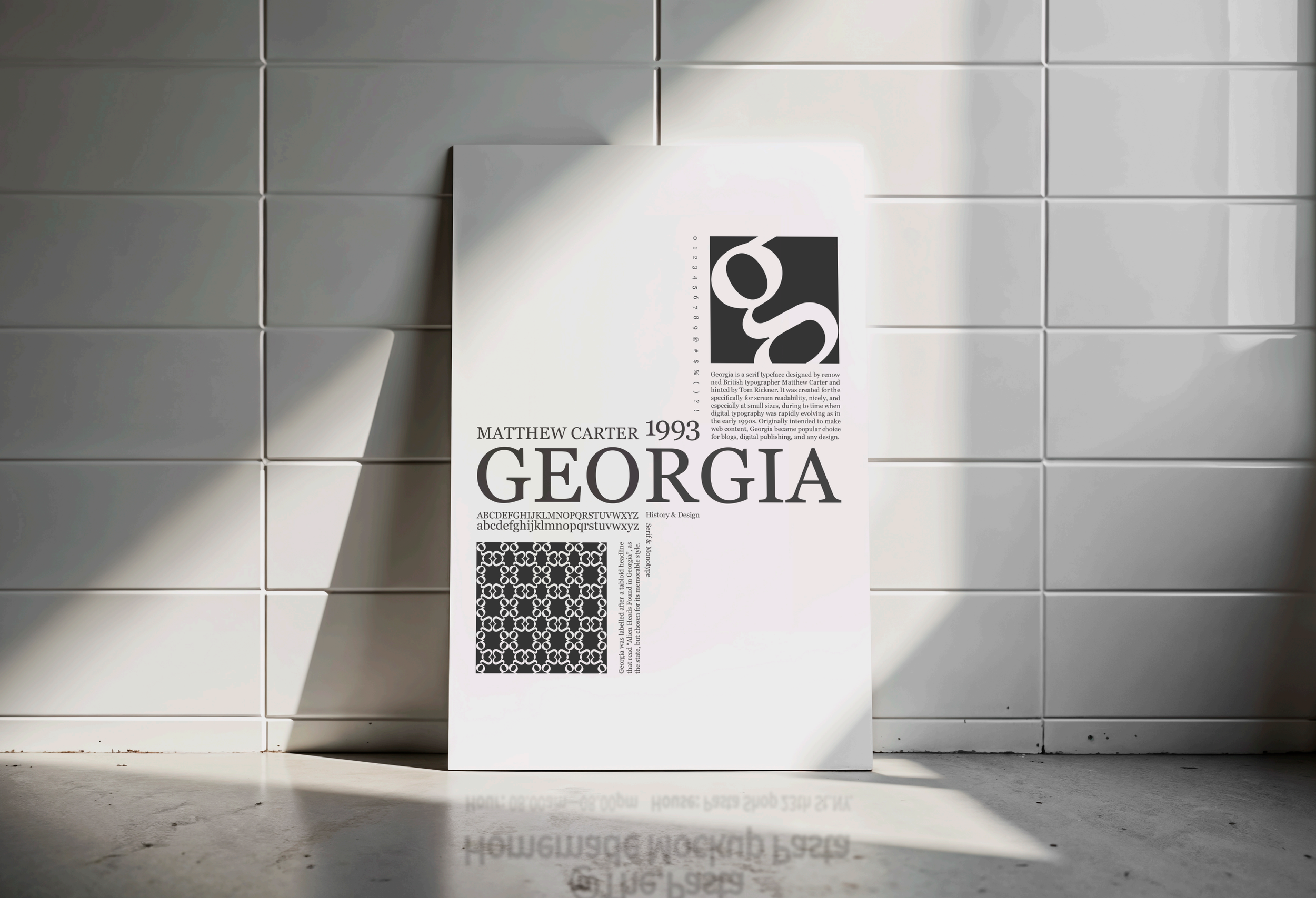
Georgia brings a classic, editorial feel. It’s highly readable and works well for print-based designs like magazines, articles, or anything that needs a more traditional and trustworthy tone.
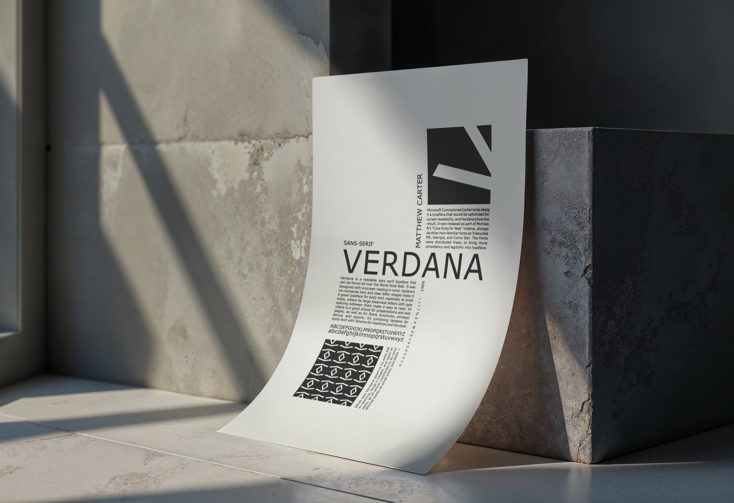
Verdana was designed for screen readability, which makes it perfect for digital interfaces. It holds up well at different sizes and resolutions, so it’s often used in websites, dashboards, and user-focused platforms.
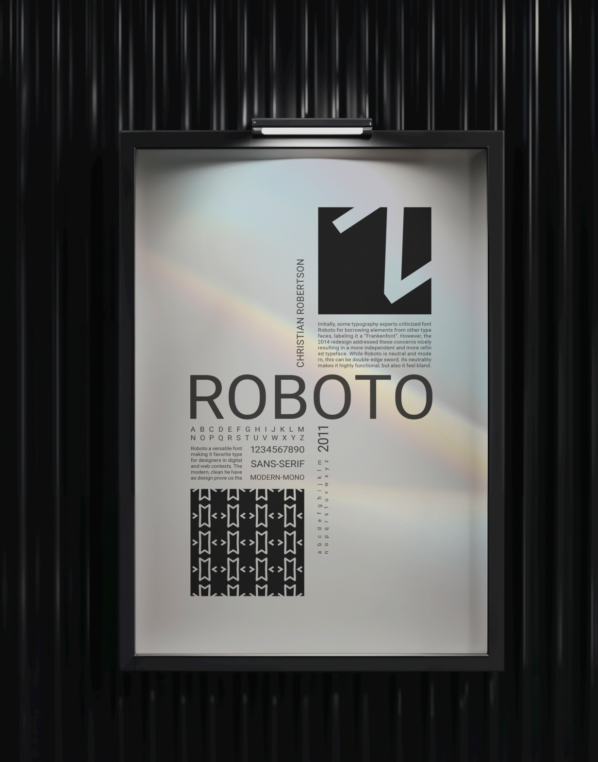
Roboto has a clean, modern structure that feels both technical and approachable. It’s widely used in digital design, including by Google, because it adapts well across apps, UI systems, and branding that need clarity and consistency.
I kept the layouts minimal and structured to let the typefaces stand out. The compositions use contrast, scale, and spacing to create visual interest without overcomplicating the design. Each poster reflects the personality of its font while still feeling like part of a cohesive system.
This project shows how typography alone can drive a design when it’s used intentionally. Each font communicates a different tone—editorial, digital, and modern—making the work both functional and visually engaging.